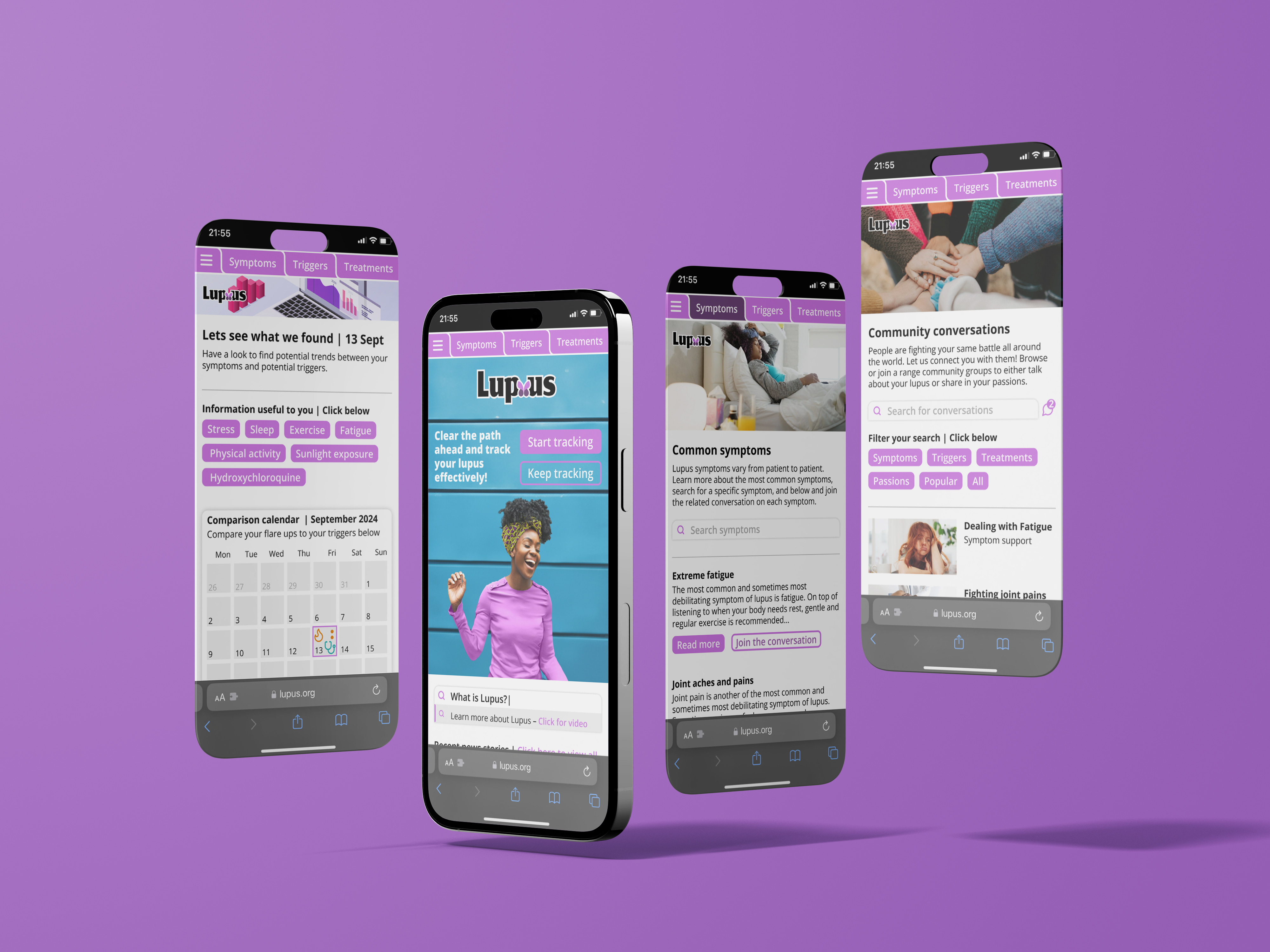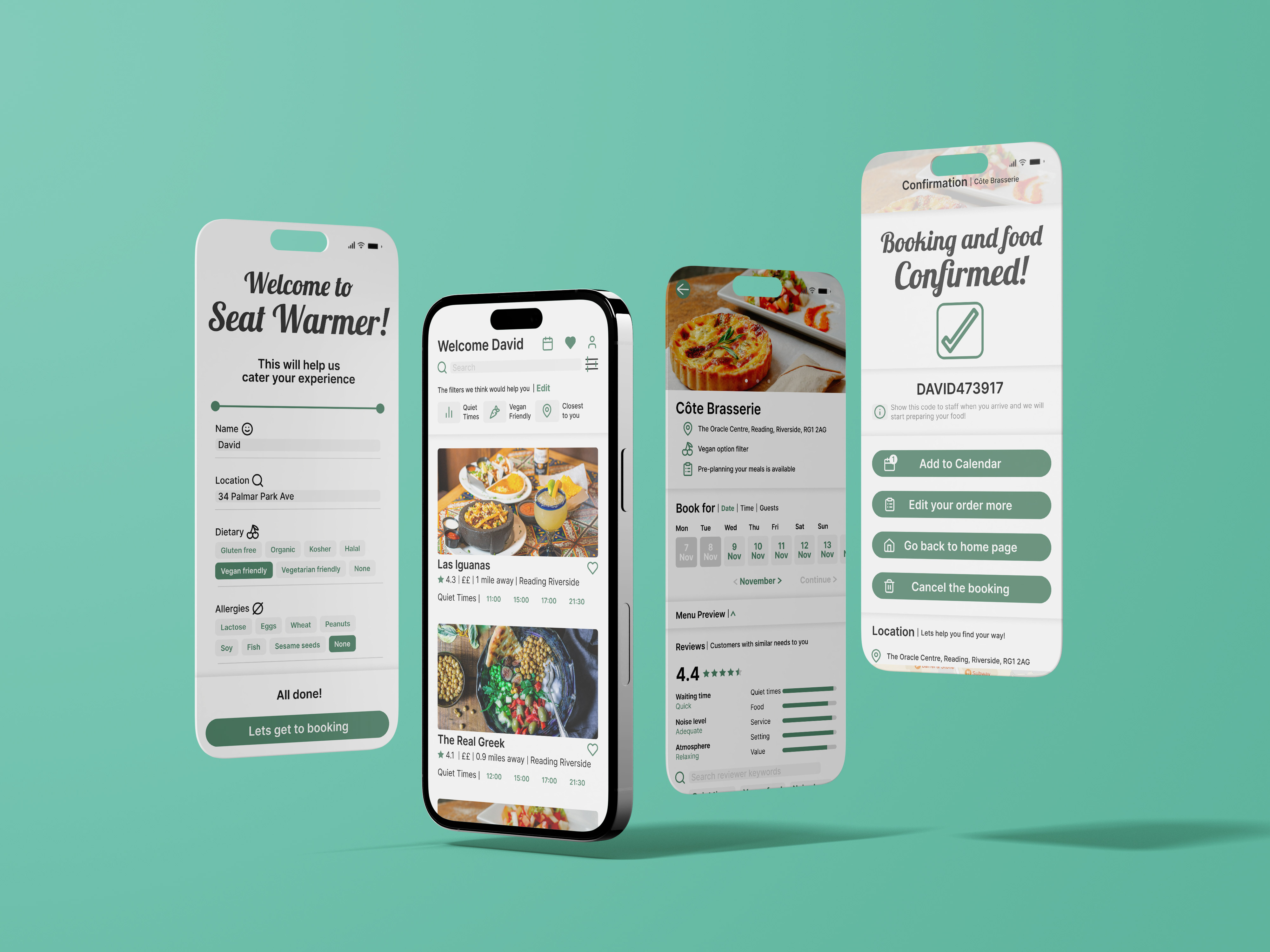
Initial research of existing data visuals designs


Researching available NHS data from both primary NHS sources and Secondary reputable sources
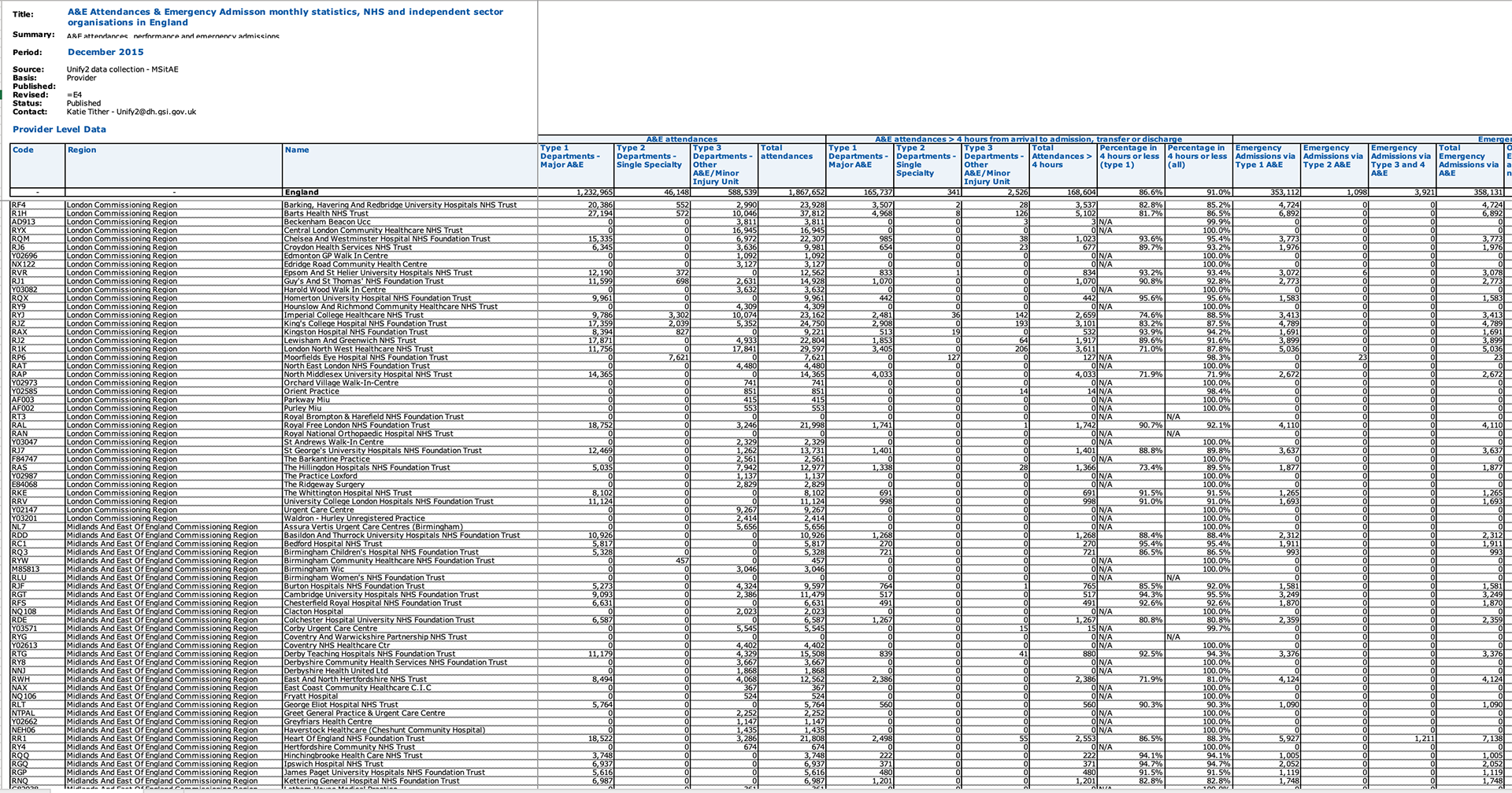
A&E waiting times data spreadsheet

Referral to treatment waiting times data spreadsheet
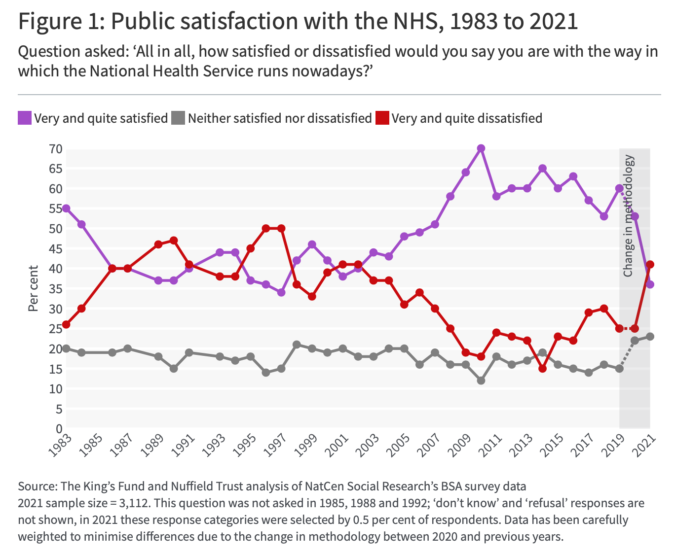
NHS satisfaction data graph
The three main data sets used for the visuals on this poster
Sketched and digital composition phases

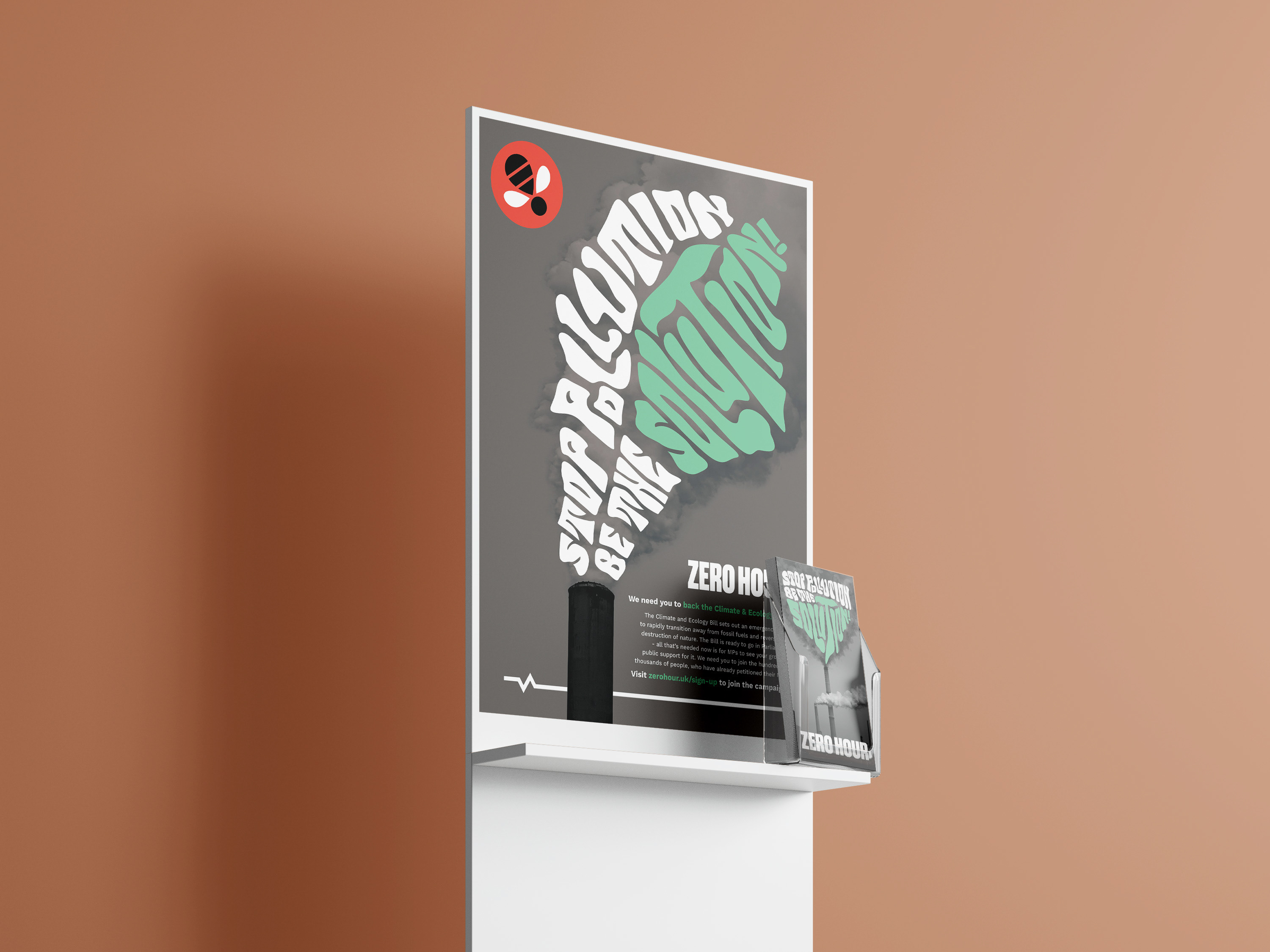
NHS infographic poster | print ready pdf